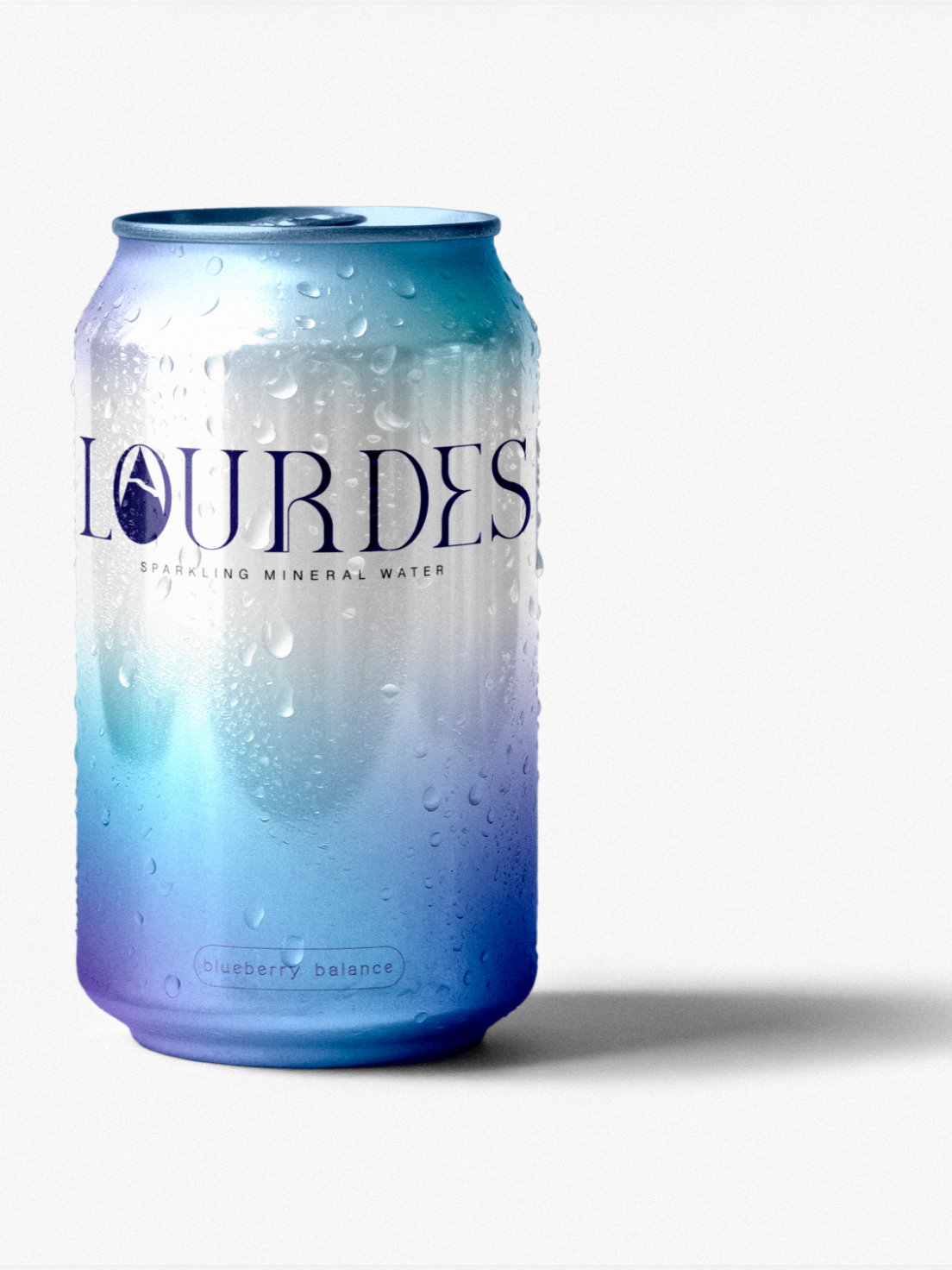
Lourdes Blueberry Sparking Water Can
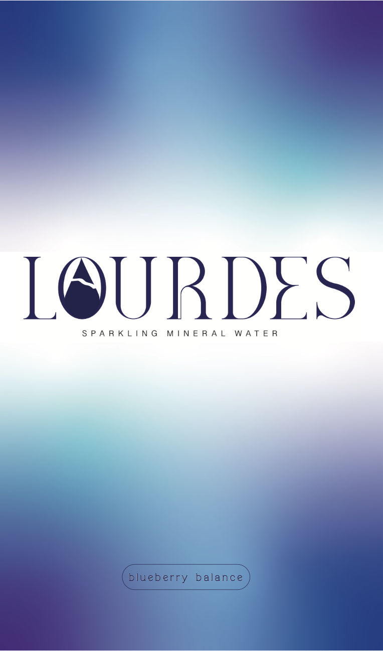
Logo and packaging designed for a mock sparkling water company. The logo is modern, but still detailed and does not sacrifice a clean look for meaning. The font used has a combination of straight lines and organic elements. A mountain and stream were added inside of the “O” in “Lourdes”, emphasizing the clean and fresh water in the packaging. The packaging consists of a can with blue and silver gradient, mimicking the look of water and the way it flows. The colors also play into the flavor of the water, in this case the flavor is blue.